Expensive Pinterest Outfits: 12 Looks
Want trendy Pinterest outfits that make you look expensive? Discover 12 quiet luxury looks, styling hacks, and AI image prompts for instant glamour.
Introduction
You’ve spent hours scrolling Pinterest. You’ve saved the boards. But when you try to recreate those trendy Pinterest outfits that make you look expensive? Something falls flat. The magic isn’t just the price tag it’s the styling language of quiet wealth. Today, you’ll learn exactly how wealthy influencers build outfits that whisper luxury. No logos required.
5 Styling Tips for Instant Expensive Energy
Monochromatic layering – One color, three textures (silk, cashmere, leather). Looks custom-made.
The 70/30 rule – 70% neutral base, 30% unexpected accent (metallic shoe, structured bag).
Gold always wins – One chunky gold necklace beats five silver dainty chains.
Shoes whisper, bags shout – Invest in quiet footwear (leather loafers, slim boots). Let your bag do the talking.
12 Trendy Pinterest Outfits That Look Expensive
1. Quiet Luxury Minimalist
Color coordination: Cream, oat, bone, warm sand. No white. No contrast.
Why it’s trending: The “stealth wealth” aesthetic rejects logos for sublime fabric quality. This outfit says “I own a gallery” without saying anything at all. Perfect for travel, coffee meetings, or looking effortlessly rich on a Tuesday morning.
Pro tip: Roll your cardigan sleeves twice. Unbutton the bottom two buttons. Adds nonchalance.
2. The Expressive Neutral Edit
Color coordination: Chocolate brown, caramel, cream, dark cognac. Leopard as accent texture.
Why it’s trending: Brown replaced gray as the chicest neutral. The suede blazer adds old-money texture. This outfit works for office, dinner, or weekend gallery openings.
Pro tip: Match your belt, bag, and shoe hardware. All gold or all silver. Mismatched metals kill the expensive illusion.
3. Icy Blue After Dark
Color coordination: Ice blue, heather grey, black, silver. Cool and sharp.
Why it’s trending: Color drenching is fading. Instead, a single icy pop against dark neutrals reads modern and intentional. The leather pants ground the ethereal top. This is what influencers wear to private dinners and winter dates.
Pro tip: Leave the silk shirt’s top two buttons undone. Collar slightly popped. It’s the difference between “office” and “after hours.”
4. The Elevated Downtown Uniform
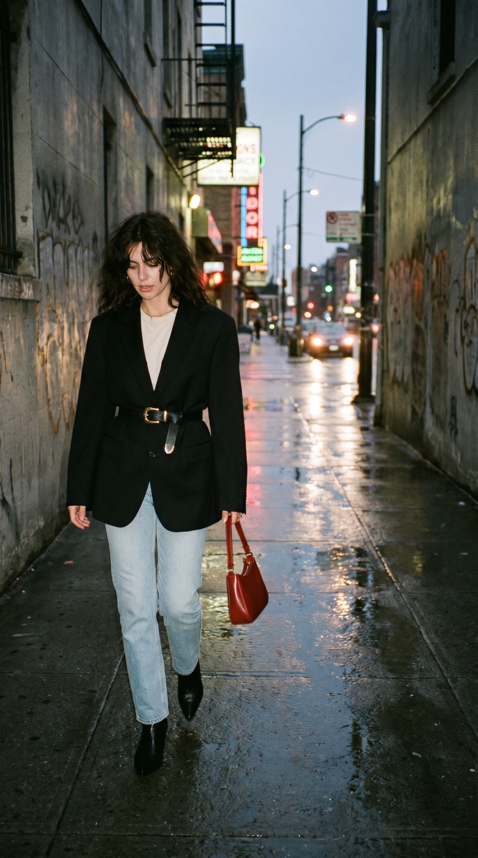
Color coordination: Cream, black, light indigo, red. Bold but controlled.
Why it’s trending: The “office siren” aesthetic meets downtown cool. The blazer-belt trick (cinching over the blazer) creates an hourglass shape instantly. Red bag adds viral color blocking.
Pro tip: Roll your jeans once to show the top of the boot. Ankles should never be fully covered here it breaks the line.
5. Monochromatic Grey on Grey
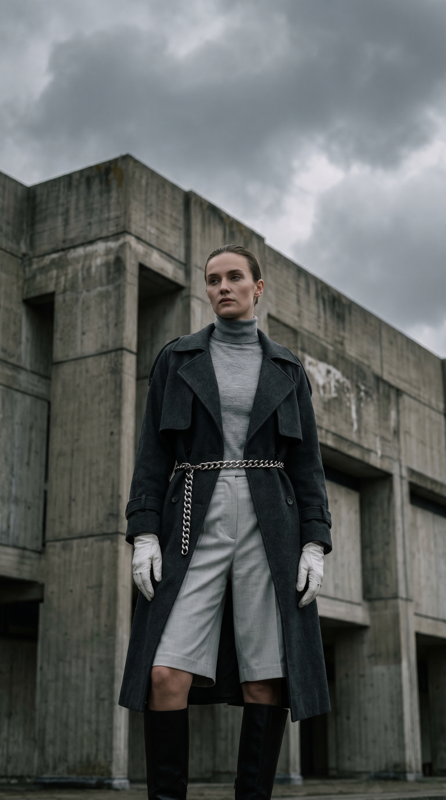
Color coordination: Heather grey, charcoal, light grey, black, silver. Full grey scale.
Why it’s trending: Shorts + knee-high boots + coat is the viral winter layering trick that broke TikTok. It reads editorial, not cold. The monochrome grey palette looks intentional and wealthy.
Pro tip: Bare legs only if you’re indoors. Otherwise, sheer black tights keep the line clean. No opaque tights they break the grey scale.
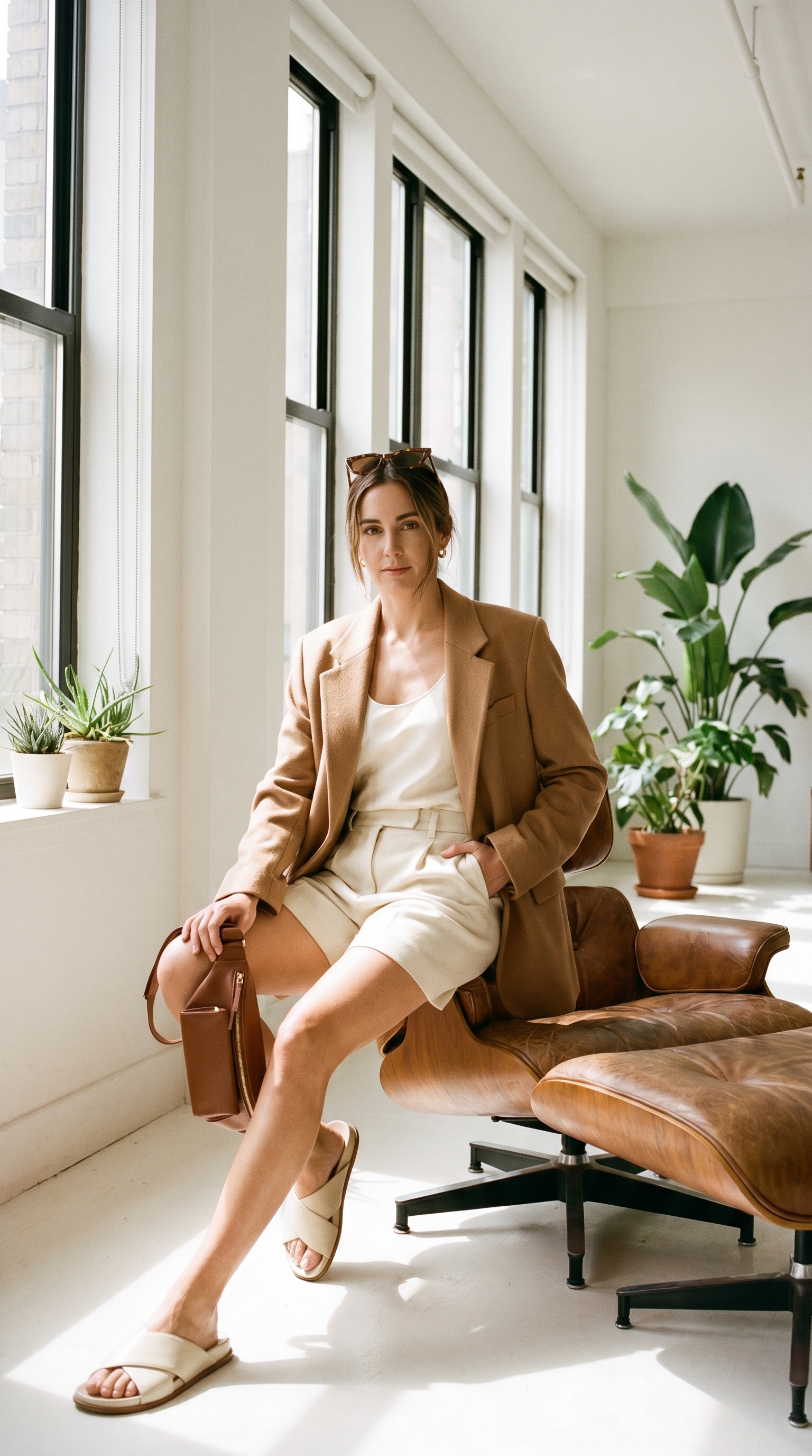
6. Latte Dressing Head-to-Toe
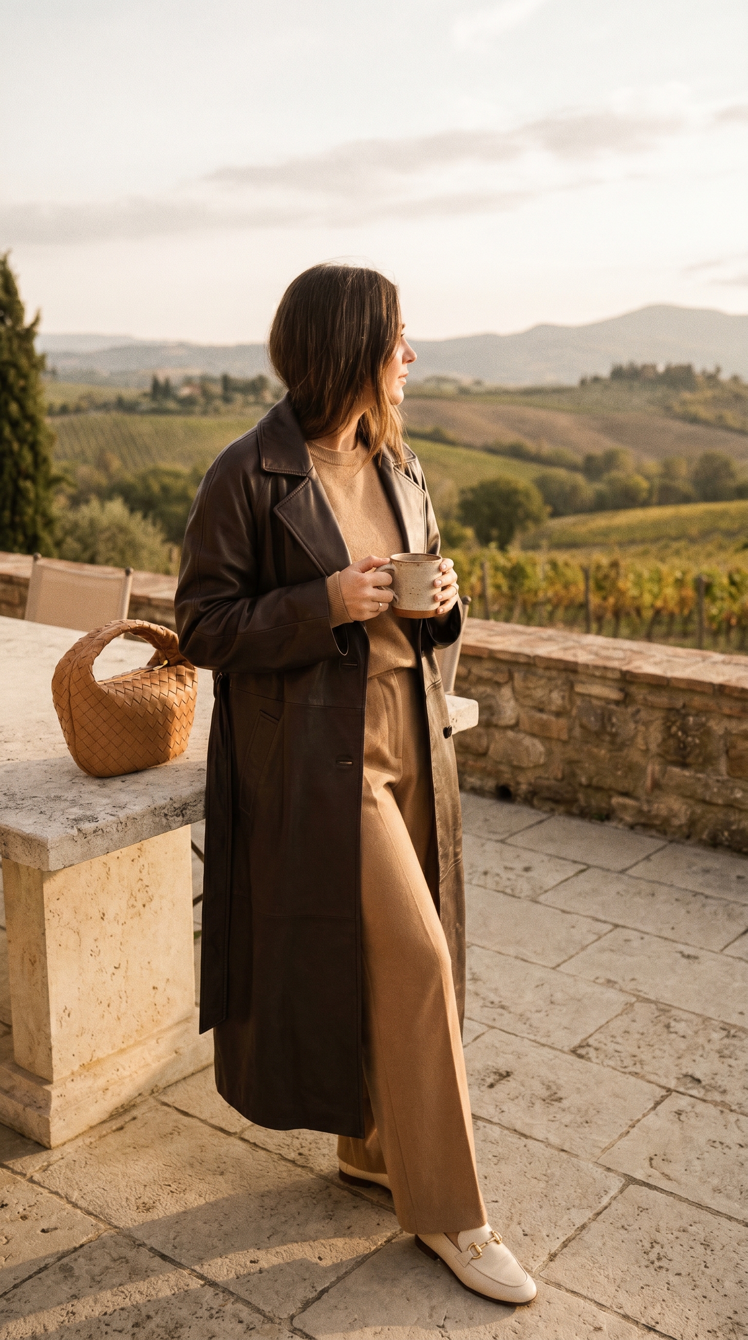
Color coordination: Camel, espresso, cream, tan, gold. All warm brown tones.
Why it’s trending: “Latte dressing” (brown + cream + caramel) is the most searched color aesthetic on Pinterest this year. It mimics expensive coffee tones and photographs beautifully in golden hour.
Pro tip: Mix matte and shiny textures within the same brown family matte cashmere, shiny trench leather, woven bag. Texture does the work of color.
7. The White Suit (But Make It Soft)
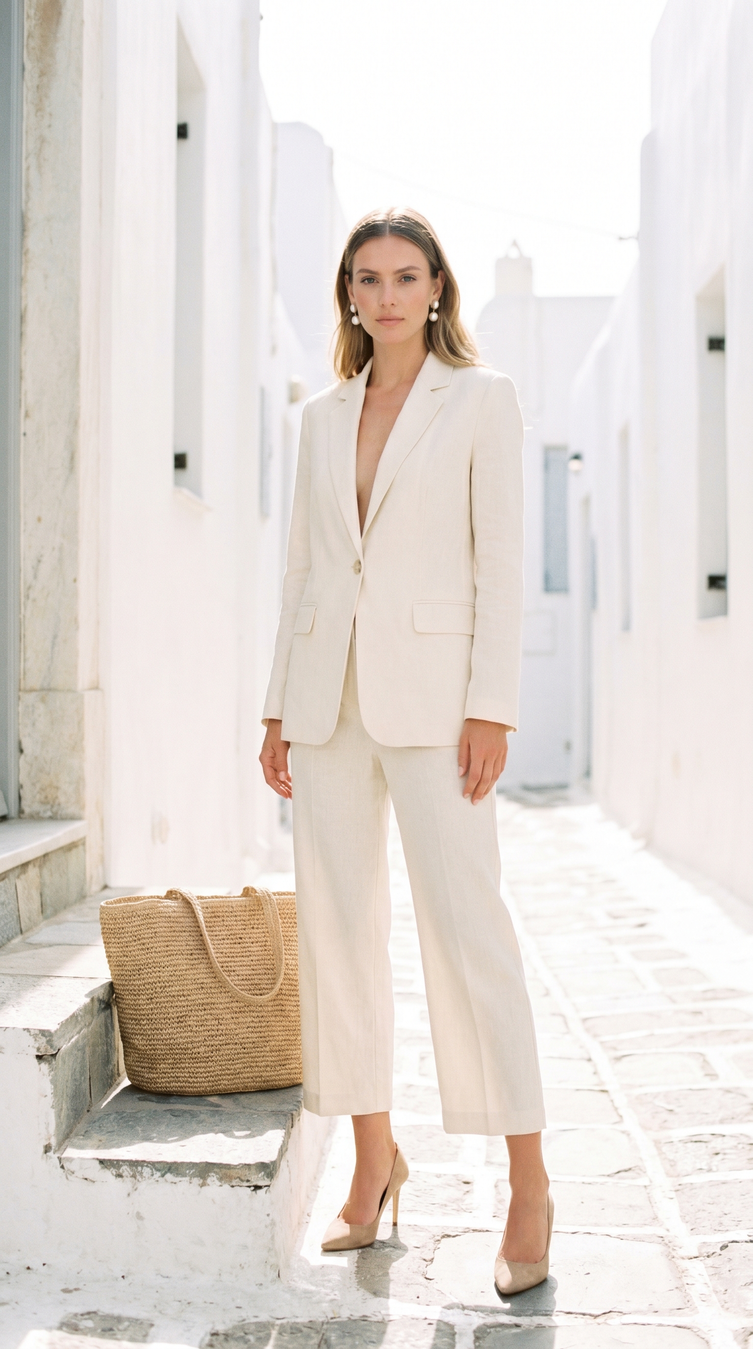
Color coordination: Cream, beige, soft brown, pearl white. No bright white allowed.
Why it’s trending: The “soft suit” movement rejects stiff tailoring. Linen and unlined construction read summer wealthy think The Row or Khaite. Perfect for garden parties, bridal brunches, or looking rich on vacation.
Pro tip: Steam your linen before wearing. Wrinkles are fine. Deep wrinkles are not. A handheld steamer is your secret weapon.
8. Deep Burgundy + Denim
Color coordination: Burgundy, dark indigo, black, silver. Rich jewel tone against denim.
Why it’s trending: Burgundy replaced red as the “unexpected neutral.” Paired with dark denim (not light wash), it reads vintage luxury. The moto jacket adds edge without cheapening.
Pro tip: Tuck your sweater only in the front. Leave back untucked. It creates that effortless “I just threw this on” illusion that actually costs hours of Pinterest research.
9. The Greige Edit
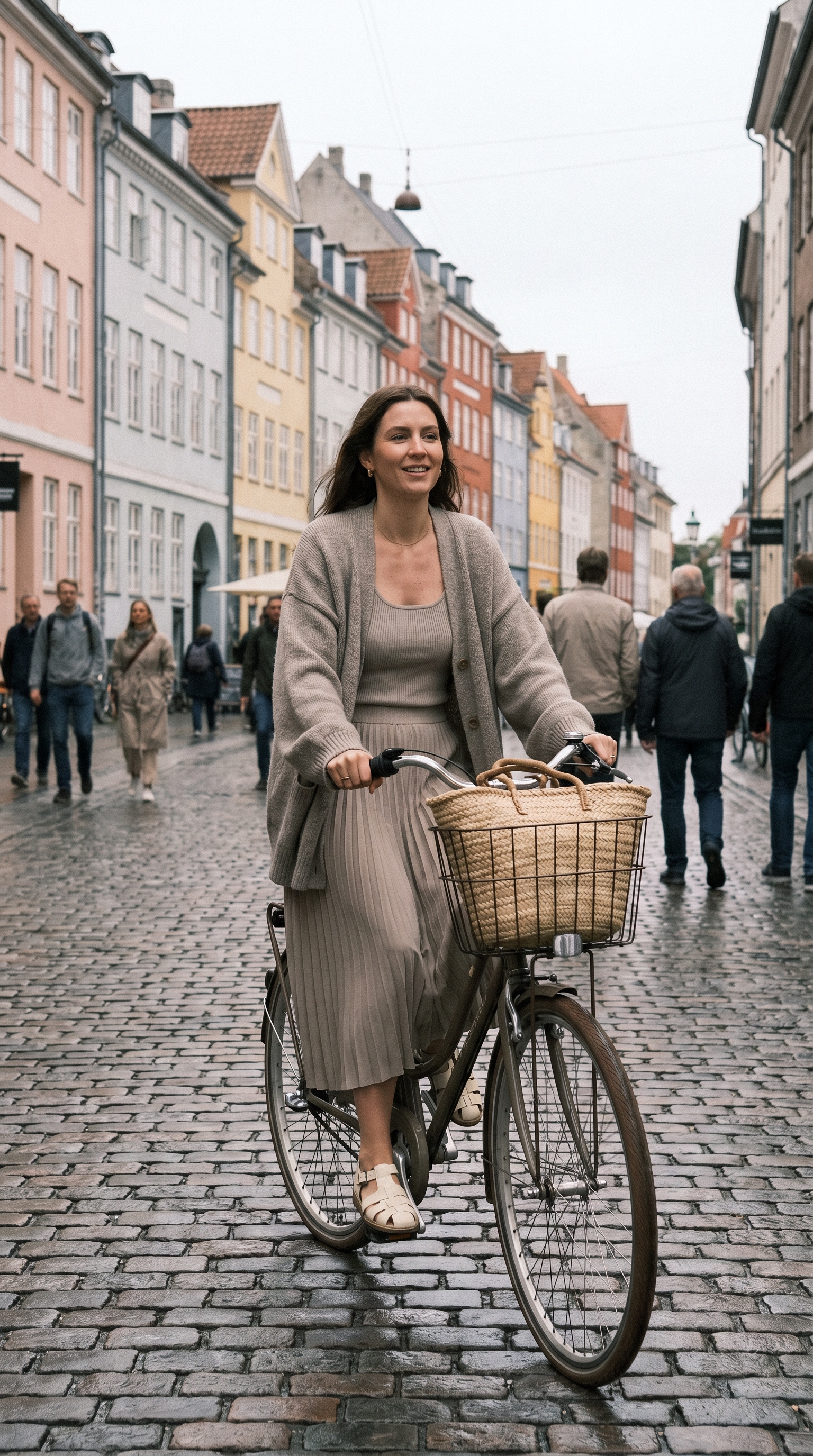
Color coordination: Greige, cream, amber, brown. All muted earth tones.
Why it’s trending: Greige works on every skin tone. The knit tank + open cardigan + pleated skirt creates vertical lines that elongate. This is what Copenhagen girls wear to bike to galleries.
Pro tip: Size up in the cardigan. You want slouch, not shape. The tank should be fitted. Contrast in fit = expensive.
10. Black Leather + Cream Knit
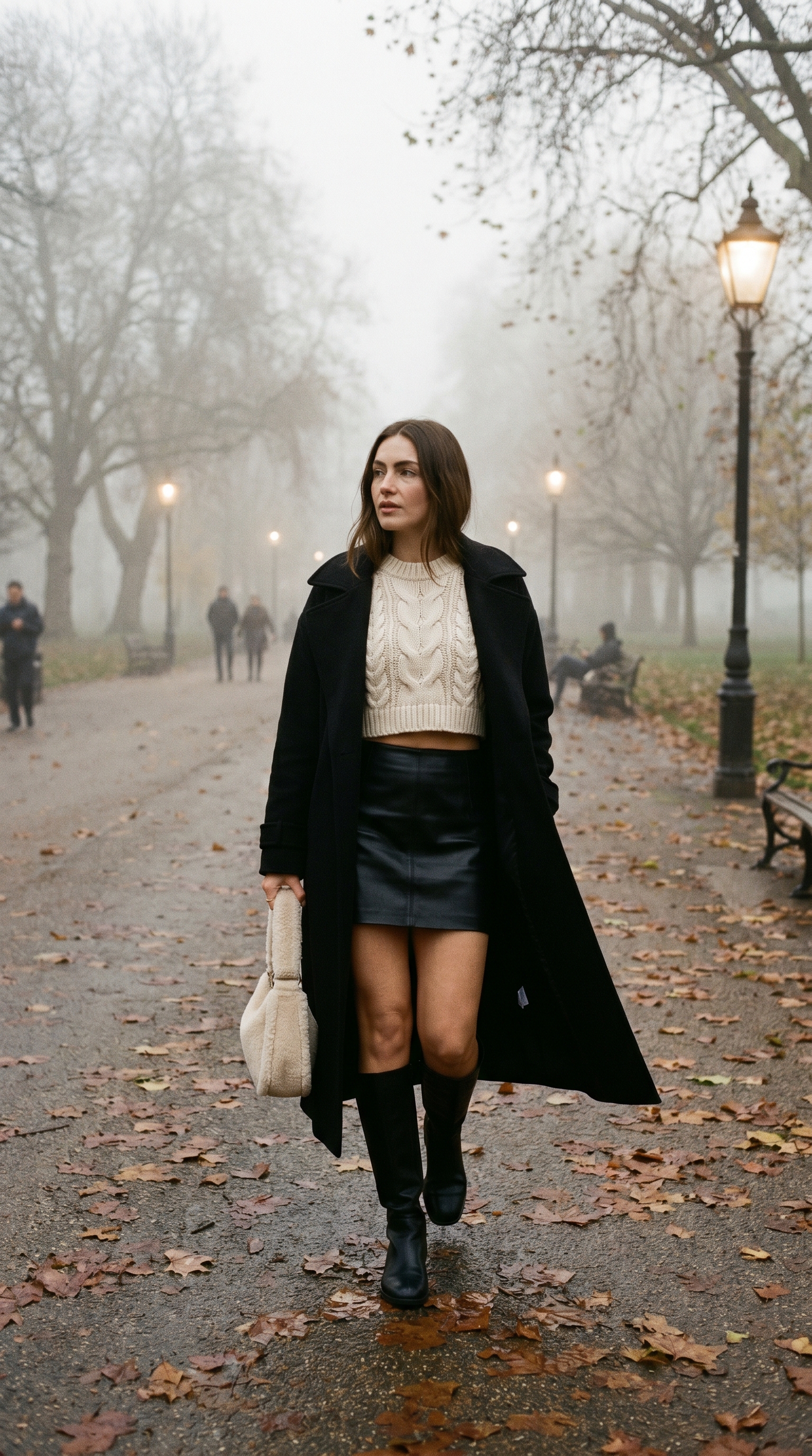
Color coordination: Cream, black, gold. High contrast, high texture.
Why it’s trending: Chunky cream knits with sleek black leather is the “soft + hard” trend that dominates Pinterest fashion mood boards. The cropped sweater balances the mini skirt length perfectly.
Pro tip: The sweater should hit exactly at your natural waist not above, not below. Measure twice before buying. This proportion makes the outfit.
11. Rust + Sage Green
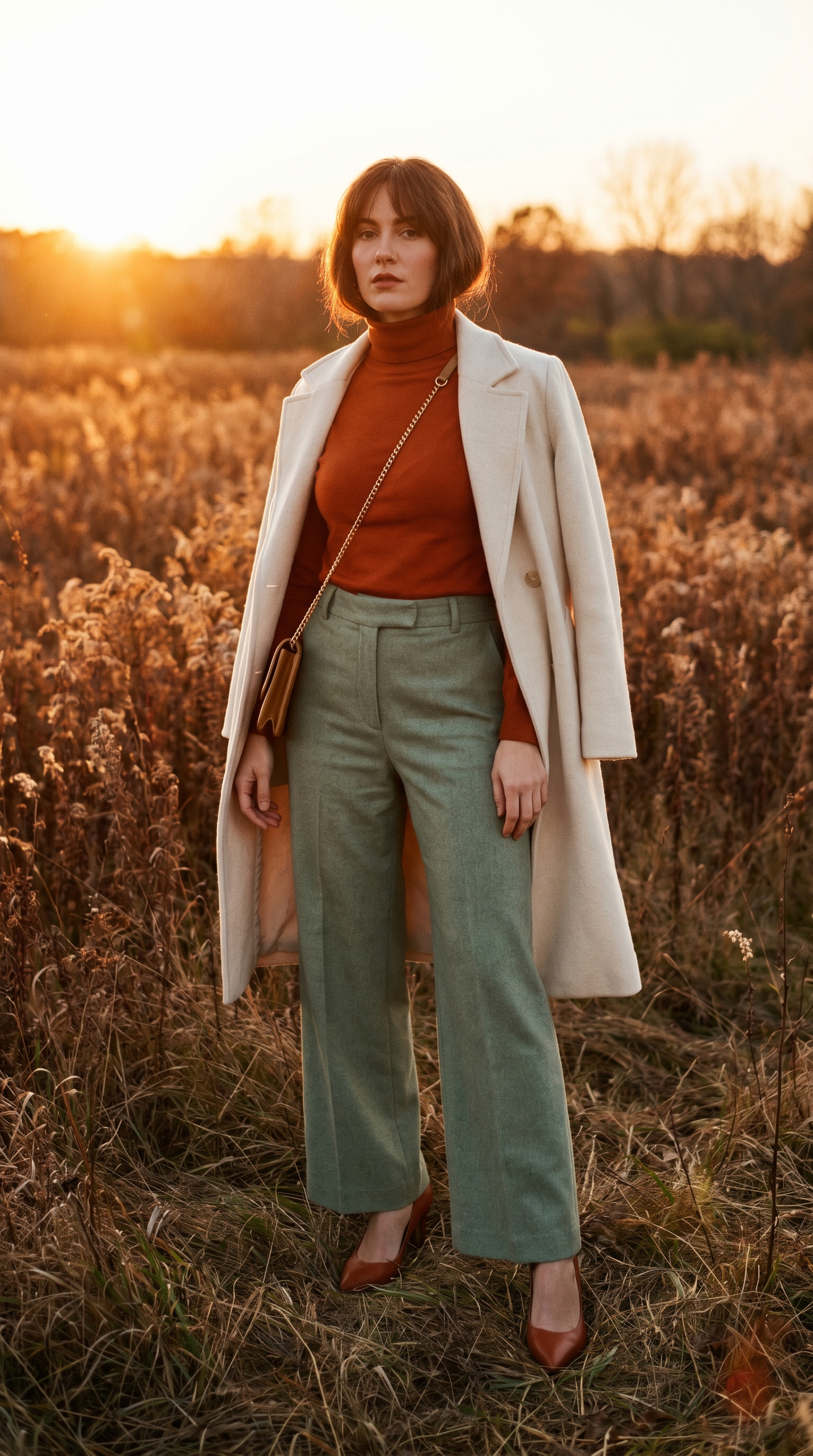
Color coordination: Rust, sage green, cream, gold, jade. Earth tones with a 1970s twist.
Why it’s trending: Rust + sage is the “autumn color palette” that works year-round. Color theory says these are complementary tones (orange-red + green-blue), so they vibrate beautifully together in photos. Pinterest loves high-drama color combinations.
Pro tip: If you can’t find rust heels, wear cream. Never black. Black kills the earthy warmth.
12. The Statement Neutral
Color coordination: Cream, camel, brown, gold. One color family, no competition.
Why it’s trending: The “hero piece” strategy is how influencers look expensive without head-to-toe designer. Spend on one architectural blazer. Everything else is basic. The blazer does all the work.
Pro tip: Roll the blazer sleeves twice to show your wrist. It signals “I’m relaxed in expensive clothes” versus “this blazer is new and stiff.”
Conclusion
Trendy Pinterest outfits that make you look expensive aren’t about spending thousands. They’re about color discipline, texture mixing, and intentional proportions. The 12 looks above give you a full wardrobe system from quiet luxury minimalism to lattee dressing to burgundy denim nights. Save this article to your Pinterest board. Try one outfit tomorrow morning. Tag your favorite look. And remember: expensive is an attitude, not a receipt.
FAQs
What are the trending fashion styles right now?
Quiet luxury (stealth wealth), latte dressing (all brown tones), greige minimalism, and office siren (structured blazers with unexpected pops of color) dominate 2025 Pinterest trends. Also trending: burgundy as a neutral, leather + knit texture mixing, and cropped sweaters with A-line mini skirts.
How do I style outfits for everyday wear?
Start with one hero piece an architectural blazer, great jeans, or cashmere sweater. Build around it using the 70/30 rule (70% neutral, 30% accent). Master monochromatic layering in grey, cream, or brown. Always add one gold accessory. Fit over fabric tailor everything. You’ll look expensive in ten minutes.
What colors are best for modern fashion looks?
Cream, camel, chocolate brown, heather grey, greige, rust, sage green, deep burgundy, and black. Avoid bright white (too harsh), neon (reads cheap in photos), and overly saturated primary colors. Stick to muted, dusty, or jewel tones. They photograph better and look more expensive on every skin tone.